MIT’s Homepage: Preposterous or Ingenious?

Our friends at MIT have an unusual approach to their homepage. They change it every day, so much so that it looks completely different from the day before. One day it is teal. The next day, red. Then yellow. They do this to “call attention to each new spotlight”, a term given to the prominent message or information they choose to highlight that day. For fun, they also have an archive of all past homepages.
What MIT doesn’t change is the primary navigation. They have a set of top-level and 2nd-level links that stay the same no matter what day you visit. Only the background image and spotlight change. When I visited recently, the homepage featured a large image of what looks to be the handles and digital interface of a treadmill. This was used to spotlight a program called the Getfit Challenge, a three-month team-oriented fitness challenge for the MIT community. Ordinarily this content wouldn’t be featured on the homepage. But it happened to be the spotlight on the day I visited the site.
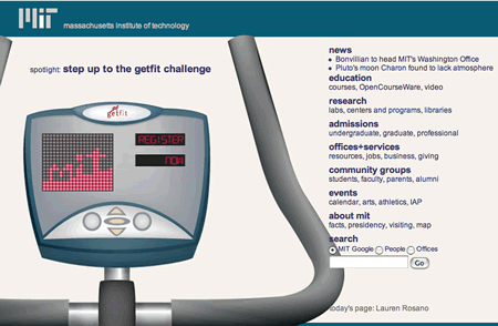
When I first saw it, I actually thought I may have typed in the URL incorrectly. After all, I had been to the MIT site before but I didn’t recall seeing anything close to this. My expectations were certainly shaken. However, upon a second look I realized that I was indeed at the correct URL, and one that was more memorable now that I knew what was going on there.
At UIE, we’ve seen a lot of homepages, but we haven’t seen many where designers take this approach. We often talk to design teams who make small changes to the homepage over time, usually promoting their latest offer or information to the most visible part of the page. Some even redesign it completely every once in a while. But changing it every day like this is unique. In most cases consistency is seen as a vital attribute for the look of the homepage. We often hear the phrase “consistent look and feel” to describe this belief.
Not so at MIT. They do what would seem preposterous to the “consistent look and feel” crowd. (I can almost hear marketing and design teams cringe.)
On the other hand, MIT does provide consistent change, showcasing content that folks might not have known about. They have obviously chosen the current knowledge approach instead of the consistent look and feel approach. They trust that new visitors will quickly understand what is going on, making the decision to highlight various programs and the creativity of the community at the expense of visual consistency. And they’ve kept at it for almost 3 years. That tells me that they’re confident it’s working.
So what do you think? Preposterous or ingenious?