Does Search Need to be in the Upper Right?
Under the brilliant guidance of Barbara Chaparro, the students at Wichita State’s SURL are one of the top web research teams in the country.
Recently, in a paper entitled Where’s the Search? Re-examining User Expectations of Web Objects, A. Dawn Shaikh and Kelsi Lenz revisit a previous study where they looked at user’s expectations for certain standard features of a web site, such as the “Back to home” link, the search box, the “About this site” link, and advertisements.
For example, when they asked their 142 study participants to signify where they’d expect a link that brought you back to the home page, 44% chose the upper left corner.

44% of participants said they expected upper left corner for the “Back To Home” link.
At first glance, this data feels like it could be useful for helping designers choose where to put their important content. If users expect to find content in a certain place, that’s where we should put it, right?
Well, what the study doesn’t address is what happens when the content isn’t where they expect. Does, for example, having the Back-to-home link in the upper right present an obstacle to users? Does it impact their ability to complete their tasks?
Our experience is a well-designed page trumps user expectations every time.

17% of participants said they expected the upper right corner for the search box.
The study shows that users expect Search to be in the upper right on the page, such as on Washington Mutual’s Home Page:
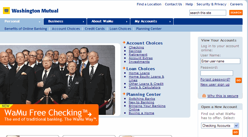
Click to see Wamu.com’s Home Page
Yet, do users who bank at Wells Fargo have more trouble with the site because their search box is more to the left?

Click to see WellsFargo.com’s Mortgage Page
Amazon’s users don’t seem to be suffering because they’ve put their search box in the center:
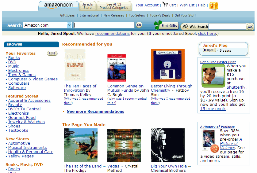
Click to see Amazon.com’s Home Page
Nor did any users we observed on BestBuy.com:
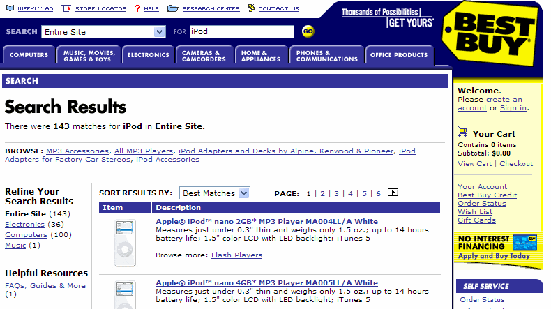
Click to see BestBuy.com’s Search Results Page
We can continue to play “Where’s Waldo?” by looking for the search box on the City of Tucson site. Can you find it? Will it affect users?

Click to see City of Tucson’s Home Page
And of course, nobody can figure out how to use eBay’s use of two search boxes on the same screen! Oh, the humanity!
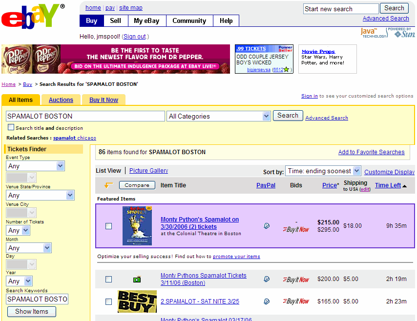
Click to see eBay.com’s Search Results Page
Just because users expect the search box to be in the upper right (at least 27% of the time), doesn’t mean that they can’t adjust to finding it in other places. After all, we humans are exceptionally adaptable to our surroundings. We can survive when the search box is 400 pixels to the left or 100 pixels down.
So, how does this study help us? If we can’t use it as guidance as to how to structure our design, does it have any value? Or is it just another one of those interesting facts, such as the numbers published in Harper’s Magazine?