The Challenges of Moving to Horizontal Navigation
Thanks to Bohdan Zograf for providing a Belorussian translation.
Thanks to Valeria for providing a Czech translation.
Thanks to Anna Chekovsky for providing a French translation.
The designers of CNN.com recently redesigned their home page, changing from a left-hand, vertical navigation scheme to a top-of-the-page, horizontal one. They even created a page that highlights their new changes.
Interestingly, the designers didn’t change (or haven’t yet changed) the interior pages of the site, driving consistency-minded designers nuts everywhere. Fortunately, however, this gives us the opportunity to look closely at the decisions they made, and to highlight several issues involved in making such a change.
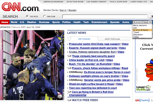
Here’s what their homepage looked like this recently:
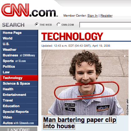
And here’s what an interior page looked like:
As you can see, the layout has changed dramatically. The content has been shifted left, where navigation used to be. The navigation is now in a thin blue bar across the top of the page. This has the positive effect of moving the visual weight away from the navigation and toward the actual story. When the navigation is on the left, our eyes are instinctly drawn to it, even when we already know what it is. This distraction, however small, is less noticable in the new horizontal design.
To get this change, the designers didn’t simply put the left-hand nav buttons end-to-end across the top of the page. No, they had to make several design choices. Most of these choices were influenced by the width of the page and the number of links they were working with.
- Link length shrinks
One of the first things to change when navigation goes horizontal is the length of links. In the CNN design, the designers shortened several links. “Business at CNN Money” became “Business”. “Sports as SI.com” became “Sports”. “Autos with Edmunds.com” became “Autos”. And “Special Reports” became simply “Specials”.Our research here at UIE has shown that the longer the link, the better it works. In this case, however, it doesn’t seem like much was lost when the links were cut down. Was “at CNN Money” really adding any relevant information to the “Business” link? Probably not much. Even so, reducing the “Special Reports” link to just “Specials” seems to have lost something.Navigation bars, however, are a special case of links. In general, we’ve seen short, one-word navigation links work at the top navigation level on sites when the subsections are relatively distinct. However, as you delve deeper into the site, links tend to work better when they are longer because they need to contain more information that differentiates them from their siblings. For instance, “Sports” and “Business” are two relatively distinct categories, so creating top-level navigation links with just those words might be appropriate. But when on the “Business” subsite, everything has to do with business, so the links need to clearly differentiate what those differences are. The more words there are in the links, the easier it is to do that.
- # of navigation choices changes
In the vertical nav configuration on the CNN subpages, there are 17 navigation choices. In the horizontal nav configuration on the homepage there are only 12. The designers have cut down on the choices in order to save space. There would not have been enough room to put all 17 on the horizontal nav bar at the same page width.In order to keep the same navigation choices as before, the designers chose to utilize a dropdown box to hold the remaining links. This is a common method that designers use when they don’t want to place all the links on the page at the same time. However, our research has shown again and again that dropdowns and flyouts don’t work very well. Our classic article Users Decide First, Move Second talks about this in more depth.As a result, I would bet dollars to doughnuts that those links in the dropdown have fewer people clicking on them than they did when they were in the vertical nav bar. The reason is simple: people have to work to see them now.
- Prioritization of choices
The designers at CNN didn’t simply take the last five links and put them into the dropdown. If they had done so, they would have chosen “Travel”, “Education”, “Special Reports”, “Videos”, and “Autos”. Instead, they chose “Law”, “Science & Space”, “Travel”, “Education”, and “Videos”. Obviously, the designers thought that “Autos” was more important than “Law” and “Special Reports” was more important than “Science & Space”. They made an explicit decision to prioritize some over others.This is a common problem issue we see with the move to horizontal navigation. At some point, things have to be cut. Instead of losing value, however, design teams can use this as an opportunity to make a site stronger focusing on what is most important on the site. We’ve seen many design teams try to include everything under the sun into their web site, when in almost all cases the vast majority of visitors come for a small sliver of content.
Those are three obvious design challenges that the team had to face when moving to a horizontal navigation scheme. Most teams deciding this very question will face these and more. Do you have any interesting challenges from a recent move to horizontal navigation? Are you considering such a move?