The NYTimes Most Popular Page
There are several ways to judge how effective content is on your web site, ranging from asking for someone’s opinion of it to seeing what people, over time, actually do with it.
The first method, the tried-and-true method of focus groups, has alarming points of failure. It turns out that people don’t necessarily answer truthfully when asked something. Or more accurately, they can’t be objective about their own opinions, or even why they hold such opinions. We’ve seen people come into user tests tell us they always read privacy policies and then go right ahead and not read any. We’ve learned over time that they’re not really lying to us, but that we should suspend our belief until after we’ve watched them for a while.
The second method, the new method taking hold on the Web, is much more interesting because we learn things about people that they can’t tell us themselves. By observing people we know they hardly ever read privacy policies, how-to instructions, or anything not written in the equivalent of 80 point types in all caps with seven exclamation points. Of course, people do read, but very differently than how they might tell us they do.
New technologies are enabling us to learn more than we’ve ever know about how people behave online. We can aggregate inbound links, number of times emailed, reactions on blogs, number of times visited and revisited, as well as a whole assortment of other metrics, depending on what statistics package we have installed and what we can cobble together on our own.
On UIE.com, for example, I can tell you that the most emailed article is 5-Second Tests: Measuring Your Site’s Content Pages. It has been emailed 40% more than the 2nd most-emailed one: What Makes a Design Seem ‘Intuitive’?.
Interestingly, the most visited article on UIE.com is not the one about about 5-second tests, nor is it the one about making designs intuitive. The most visited article is one that is emailed only half as much. It is the Branding and Usability article.
Why the discrepancy? Why aren’t the most emailed articles the most visited as well?
Surely, the answer is an evil multi-variable math problem. We could look at the inbound links of the articles to see if those links give off the right scent and so set accurate expectations about where the links goes. We could see if there are more trigger words in one article vs. another. We could see what topics are popular on the Web at the moment and see if that has any affect. And there are countless other things we could look at, shake our heads over, and otherwise ponder.
Recently I’ve been watching the new Most Popular page on the New York Times web site. On that page you’ll see this:
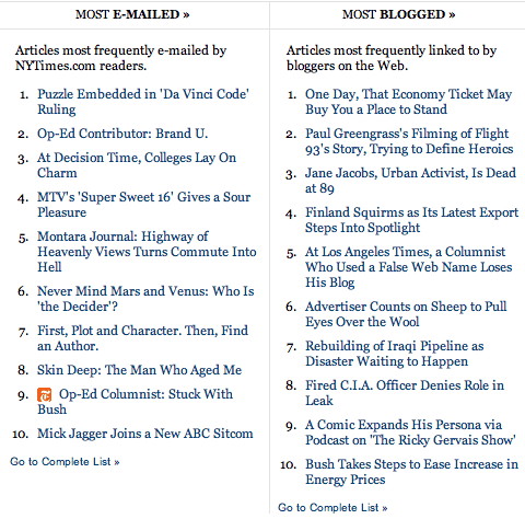
Here are two lists. One is most emailed, and one is most blogged about (most linked-to). The lists are rarely the same, and usually only have a couple of articles that overlap. As you can see, when I grabbed this screenshot there were zero overlaps. How can that be?
The answer might have to do with accounts. You have to be signed into a NYTimes account in order to email an article. On the other hand, anyone can link to an article. Or the answer might be technical. When you link to an article, you probably link to whatever URL is in your browser, but most articles have a myriad of different URLs because of the variables attached at the end of them. The article that I read is going to have my account identifier attached to its URL, while an article that someone else reads will have their account identifier attached to its URL. Different URLs… all for the same article. The answer might also have to do with the patterns in how people read. People will email things instantly, but probably mull things over a bit before they link to something. After all, they might write up a short post about the article they’re linking to, and that takes time.
These three reasons may or may not have any affect on how the Times comes up with their most popular rankings. I don’t know, but I do know that there are many other reasons in addition to these that could complicate this matter even further. The end result is that there are too many variables to sift through easily, and so any analysis of the real value of content would probably come with a large set of disclaimers, such as “this was affected by the recent White House dustup” or “this was affected because it wasn’t posted until later in the day”.
The Most Popular page fascinates me because of what it might be saying about how people value content. But beyond an interesting novelty it’s hard to know what the lists on the page actually mean, given the large number of things that affect how people behave on the Web…and the increasing complexity with measuring those things.
Kind of makes me feel like just asking someone instead.