Why MySpace is Good for Design

You’ve got to hand it to MySpace. The designers there have done the impossible: they’ve created a site that tramples on the aesthetic sensibilities of nearly everyone while continuing to grow and be successful.
Today’s homepage, a page cluttered with ads for the new movie Red Line, is just another in a long line of disorienting, disquieting, overly-saturated designs that makes you wonder: “Why? Why on earth would MySpace create a billboard for Satan?”
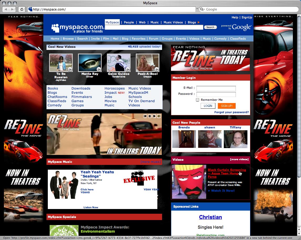
(click for full-size screenshot)
It’s no wonder that every time we get talking about MySpace some very passionate conversation ensues. It is almost impossible to see through the visual clutter of the site to reveal the value that people are actually getting out of it.
Bad Design, Great Conversation
That’s why I think MySpace a great thing for design. Not because the homepage makes one’s head hurt, but because it so obscures the value that its members are getting that it always leads to passionate conversations. It gets graphic designers riled up, interaction designers in a tizzy, and product leads simply shaking their head.
Just yesterday, Jared and I were in a meeting with a design team and the subject of MySpace came up. Boy did the conversation begin to move then! Everyone went from a caffeine low to a can’t-get-a-word-in edgewise high. It was fabulous. Everyone had an opinion, and everyone was involved. That in itself is valuable.
What often happens at this point is that the notion of value has to come to the forefront for MySpace to make sense. We can’t imagine value coming from something so ugly, so we have to rely on asking actual MySpace users to find out why they’re so connected to the site. If you have done this or ever have the chance to, do it! You’ll find it incredibly interesting. The conversations that I’ve had with MySpace users has really changed the way I think about design…as well as the entire value proposition of social software.
To that end, ethnographers and usability folks, who study the actual behavior of people, are fascinated by MySpace. It’s like studying an alien civilization. The site breaks all the rules. Our common notions of design just don’t apply. It’s truly another world.
This is a good thing! The frustration we feel when looking at MySpace is a catalyst for evaluating our own design practices. Are we making too many assumptions based on how we personally feel? Are we in tune enough with the people we design for? Are we focused too much on visuals and not enough on other ways of providing value? Are we not targeting the right population? The questions that MySpace forces on us are valuable, enlightening, and always controversial.
So what do you think? Do you agree that MySpace is good for design? Or do you see it as a blot on the face of the Web?