Google Redesigns Analytics

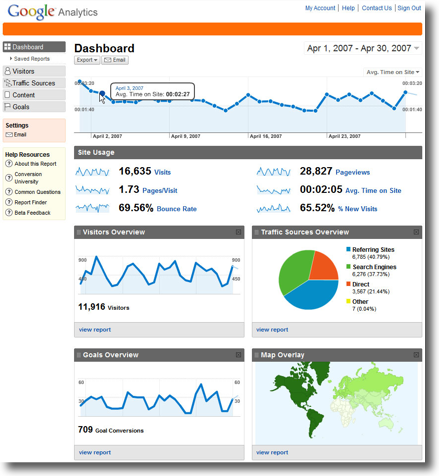
Google has just announced an overhaul of their Google Analytics product. Along with new features, it sports innovative interactivity and information display with great use of colors and visual weight.
Joshua Porter and I have been spending the last few days going through a lot of the new features, and new ways to visualize old features and we’re coming away impressed.
One particular feature that caught our eye was the funnel navigation reports. The funnel is something we’ve talked about before, we called it The Customer Sieve. Google’s new tool allows you to see the number of people who begin a multi-page process, and see progressively how many people bail out at each step on the journey, and also where they bail out to. Very useful information that you can use to fine tune the journey.
For an inside look at the revision, may I suggest:
» There is a delightful Flash tour video on the Google Analytics site. Section five includes coverage of the funnel navigation demo.
» Find an in depth discussion at Google Analytics Evangelist Avinash Kaushik’s blog, featuring several screenshots and explanations.