Seeing Red: SmartMoney.com’s Map of the Market
by Jared Spool
A normal day at the SmartMoney.com Map of the Market interactive market mapping tool:

But yesterday was anything but a normal day:
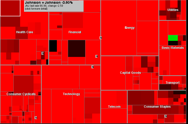
(The green box represents Barrick Gold, which saw a 4.5% increase in its value yesterday. The next biggest winner I could find was Campbell’s Soup at 0.32%. Gold? Soup lines? Hmmm.)
Update: A new day brings a new market bounce:

(A green day should not be confused with Green Day.)
Published here on September 30, 2008.